Best Practices for User-Friendly Cart Design
Enhance your e-commerce success with a user-friendly cart design that reduces abandonment and boosts conversions through clear navigation and pricing.

69.57% of online shopping carts are abandoned. Why? Complicated checkouts, unexpected costs, and poor mobile experiences are major culprits. A well-designed cart can fix this by simplifying the buying process, building trust with clear pricing, and reducing friction for users.
Key Takeaways for Better Cart Design:
- Simplify Navigation: Use clear layouts, standout "Checkout" buttons, and easy-to-find cart icons.
- Mobile Optimization: Ensure responsive design, touch-friendly buttons, and minimal scrolling.
- Transparent Pricing: Show item costs, shipping fees, taxes, and totals upfront.
- Accessibility: Meet WCAG 2.1 standards with features like keyboard navigation and readable fonts.
- Boost Sales with Features: Add upsells, progress bars for free shipping, and real-time updates.
Focus on creating an intuitive, mobile-friendly, and accessible cart to lower abandonment rates and increase conversions. Let’s explore how to make your cart work better for your customers and your business.
Key Features of a User-Friendly Cart
Organized Layout and Simple Navigation
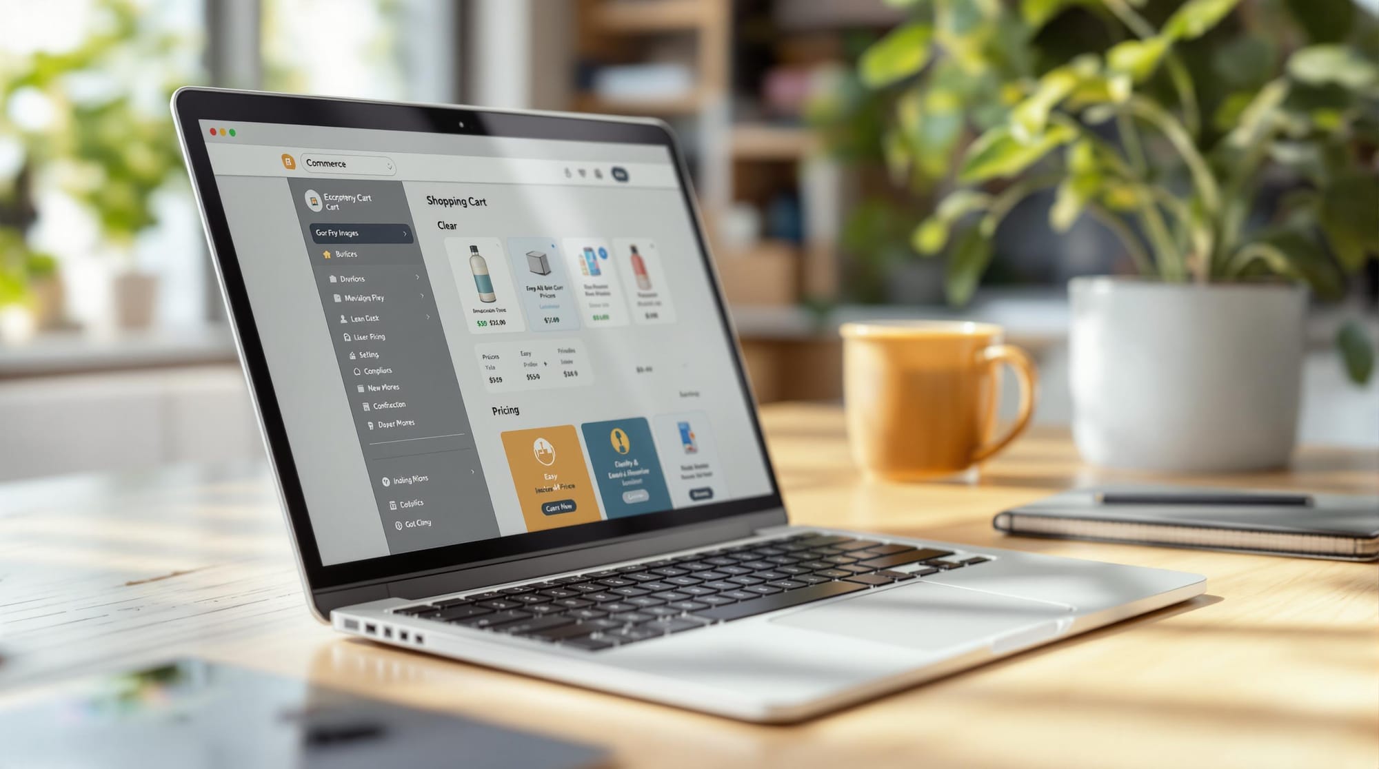
Placing the shopping cart icon in the upper-right corner makes it easy for shoppers to find and access their cart . An effective cart design begins with a straightforward layout that naturally guides users through the buying process.
Important elements to include:
- A standout "Checkout" button in a contrasting color to draw attention
- A clearly visible "Continue Shopping" option for convenience
- Simple "Edit Cart" tools for adjusting quantities or removing items
Mobile-Friendly Cart Design
With the rise of mobile shopping, a responsive cart design is a must. It should adjust smoothly to different screen sizes while remaining functional . Mobile-optimized carts should focus on touch-friendly features and fast performance.
Key features for mobile optimization:
- Large, easy-to-tap buttons with enough spacing to avoid errors
- Minimal scrolling for a smoother experience
- User-friendly quantity adjusters designed for touchscreens
- Simplified navigation tailored to smaller displays
Transparent Pricing and Costs
Clear pricing details can build trust and help reduce cart abandonment. Studies show that unexpected costs are a major reason shoppers leave their carts. To address this, provide a detailed cost breakdown that includes:
| Cost Component | What to Display |
|---|---|
| Item Prices | Individual prices and subtotals |
| Shipping Fees | Exact rates or free shipping info |
| Tax Calculations | Real-time estimates by location |
| Final Total | Full order cost in a prominent spot |
Progress bars showing free shipping thresholds or gift eligibility can also encourage larger purchases and reduce abandonment [3]. Additionally, ensuring your cart is accessible to all users will make it more inclusive and easier to use.
5 Ways To Reduce Your Cart Abandonment Rate
Making Carts Accessible for All Users
With 71% of e-commerce sites struggling with accessibility issues, meeting standards like WCAG 2.1 is more than just a checkbox - it's a must for legal compliance (e.g., ADA) and improving the user experience. Accessibility works hand-in-hand with features like mobile optimization and clear pricing transparency .
Compatibility with Assistive Tools
Building an accessible cart means focusing on specific elements that improve usability for everyone:
| Element | Implementation | Purpose |
|---|---|---|
| Alt Text | Add descriptive text for product images | Helps screen readers provide accurate item details |
| ARIA Labels | Use clear labels for buttons and forms | Makes interactive elements understandable to readers |
| Keyboard Navigation | Ensure all elements work via tabbing | Enables operation without a mouse |
| Focus States | Add visible indicators | Highlights the active element for easier navigation |
| Font Size | Minimum 14px | Improves readability on various devices |
| Font Family | Arial, Helvetica, Open Sans | Ensures clear and easy-to-read text |
| Color Contrast | Minimum 4.5:1 ratio | Aligns with WCAG standards for visibility |
| Interactive Elements | Provide clear visual feedback | Shows users which items are clickable |
Every interactive feature in the cart - like quantity adjusters, remove buttons, and checkout steps - should work seamlessly with keyboard commands. The tab order should flow logically from top to bottom and left to right, ensuring smooth navigation.
Typography and Color Accessibility
"Accessibility isn't optional - it's essential for everyone."
To spot potential issues early, use tools like WAVE and Lighthouse. Testing your cart with screen readers and keyboard navigation is crucial to guarantee a hassle-free shopping experience for all users.
Improving the Cart to Boost Sales
Optimizing your cart can increase both conversion rates and average order value (AOV). The key is to add features that encourage purchases while keeping the shopping experience smooth and intuitive.
Using Cart Drawers for Faster Checkout
Cart drawers simplify the checkout process by letting customers manage their purchases without leaving the current page. This reduces interruptions and helps maintain their buying momentum. Shopify offers flexible cart drawer options that can easily blend with your store's design.
| Feature | Benefit | How to Implement |
|---|---|---|
| Zero-redirect Experience | Keeps customers in the shopping flow | Use AJAX for live updates |
| Customizable Design | Aligns with your brand's look | Adjust fonts, colors, layout |
| Sticky Checkout Button | Easy access to checkout | Fix at the bottom of the drawer |
| Multi-language Support | Reaches a global audience | Add automatic language detection |
Once your cart is easy to navigate, you can take it a step further by adding features like upsells to increase its profitability.
Adding Upsell and Cross-Sell Options
Smart upselling can drive additional revenue by offering customers relevant extras that enhance their purchase.
"The most effective upsells are those that complement what's already in the cart, creating value rather than just pushing for higher spend."
Modern tools make it easier to implement these strategies. Consider options like:
- AI-driven product recommendations tailored to cart contents
- Discounts for bulk purchases to encourage larger orders
- One-click add-to-cart options for related products
- Special gift offers activated when spending reaches a certain amount
Using Progress Bars to Encourage Spending
Progress bars work by tapping into goal-setting psychology, motivating shoppers to reach specific spending thresholds.
For best results, progress bars should:
- Update in real-time with clear messaging about how much more is needed
- Showcase rewards or milestones already achieved
- Stay visible throughout the shopping experience
Testing and Customizing for Better Results
Fine-tuning your cart design is all about testing and tweaking to meet user needs while boosting conversions. According to a HubSpot study on cart optimization, A/B testing can improve e-commerce cart conversion rates by as much as 25% .
Testing Different Cart Designs
A/B testing helps uncover what works best for your audience. Here are some key areas to focus on:
| Element | What to Test | Metrics to Track |
|---|---|---|
| User Experience | Layout types, button placement | Time to checkout, click-through rates |
| Offer Strategy | Discount types, upsell placement | Average order value |
| Visual Elements | Progress bar designs, CTA styles | Engagement rates, conversion impact |
Stick to consistent testing periods and gather enough data before making changes. Keep an eye on metrics like conversion rates, average order value, and cart abandonment rates to gauge success.
"A well-designed cart maximizes conversion rates and enhances the customer experience." - Aftersell, "Unlock your cart's potential: 5 strategies from Shopify's top performers" [3]
Customizing the Cart for Your Brand
Once testing reveals what works, customization ensures your cart reflects your brand while staying functional. Focus on these areas:
Visual Elements
- Use brand-specific colors and typography.
- Place CTAs strategically.
- Optimize product images for clarity and appeal.
Functional Features
- Offer multi-language support.
- Add sticky checkout buttons for ease of use.
- Ensure the design works seamlessly on mobile devices.
With mobile shopping leading e-commerce sales, prioritize mobile-friendly features. This includes using responsive design and optimizing images for faster loading times [3]. The most effective cart designs combine style and usability, tailoring customizations to fit your customer journey and business objectives. Regular testing will show which updates deliver the best performance for your store.
Conclusion: Steps to Build a Better Cart
Creating an effective cart means striking the right balance between user experience and boosting conversions. By combining tried-and-tested strategies, advanced tools, and ongoing testing, you can design a cart that keeps customers engaged and reduces abandonment.
Key Features to Improve Your Cart:
| Feature | Purpose | Impact |
|---|---|---|
| Dynamic Progress Bars | Highlight shipping/gift thresholds | Encourages higher spending |
| Mobile & Accessibility | Ensure usability across devices | Reaches more users, improves ease of use |
| Real-time Updates | Reflect inventory and price changes | Builds trust and transparency |
While mobile optimization and accessibility are crucial, leveraging advanced tools can take your cart performance to the next level. For example, tools like CRO Cart Drawer integrate AI-driven recommendations, personalized offers, and frictionless checkout - all without compromising page speed.
Steps for Ongoing Improvement:
- Monitor metrics like conversion rates and average order value.
- Test different layouts, offers, and visuals to see what resonates.
- Collect feedback from customers to pinpoint problem areas.
- Prioritize optimization for mobile users, as they make up a large portion of online shoppers.
Keep in mind that cart design should evolve alongside customer preferences and market trends. Eliminate pain points like confusing navigation or slow checkouts, and focus on strategies that encourage higher order values, such as upsells and clear incentives. A cart with transparent pricing and smooth functionality not only satisfies customers but also boosts your revenue [3].
FAQs
How can an e-commerce business reduce the number of abandoned carts on its website?
Cart abandonment is a common issue for e-commerce businesses, but it can be addressed with the right strategies. Here are some effective approaches:
| Strategy | Implementation | Impact |
|---|---|---|
| Save Checkout Info | Let customers save shipping and payment details | Speeds up future purchases |
| Mobile Optimization | Use responsive design and fast loading times | Enhances mobile experience |
| Streamlined Process | Cut unnecessary steps in checkout | Reduces friction |
Key Cart Features That Help
A user-friendly checkout process is critical. Simplifying the steps and allowing customers to save their details for future use can make a big difference. This is especially important for mobile users, who often abandon carts due to complicated processes [3].
Modern Cart Solutions
Today's cart tools can improve the shopping journey with features like:
- Real-time inventory updates to prevent out-of-stock surprises
- Progress bars and shipping thresholds to encourage completion
- Clear payment options displayed prominently
- Easy item editing directly in the cart
Elements like transparent pricing and mobile-friendly designs are also essential. By focusing on these improvements, businesses can reduce cart abandonment and boost conversions .